
Think Like a Photographer – How to Curate Great UGC
Today, nearly everyone has the power and ability to capture and create quality content right at their fingertips. As a business, you can harness User-Generated Content (UGC) – the content created by others – to help tell your story in an authentic and trustworthy way.
User-generated content encompasses images, videos, testimonials, blog posts and other content posted by unpaid contributors (in our case, travellers) to online platforms. Learn more about the basics of UGC, why it needs to be a part of your marketing strategy, and how to find it for your business by clicking here.
This article will explore how to best curate visual UGC for your business – by thinking like a photographer:
Curate with Purpose
As you start to plan your UGC strategy, consider the value of the content you bring to your audience, and think about the strategic purpose of each post you share. With the amount of content created daily, we are constantly competing for people’s attention -which is exactly why you don’t want to rush and share every photo that someone has posted of your business. You want to find images that are visually enticing, that tell your brand story, and – most importantly – that highlight or explore what your guests care about.
Before sharing UGC, always ask yourself, “What’s the goal for this piece content? Is this something my guests want to see?”
Tell a Story
Look for UGC that says something about your product, experience, or destination. This doesn’t mean that your business must be “front and centre” in the photo; sometimes, it’s the small details that count. Highlighting visitors enjoying your experience or having your product in the background can allow a bigger story to be told and help your audience connect with the image.

This image by @mywhiskeygirl captures a heartwarming moment of 7-year old dog Whiskey eagerly looking into a Harbour Air float plane. When Harbour Air shared it, the image also told visitors that the business welcomes all types of visitors – including canine!
Be Authentic
Always look for photos that portray real emotion your audience can connect with. Avoid images that look staged, or overly photoshopped. You want your viewer to stumble across the photo in their feed and have it pull them in so they can imagine seeing themselves there.
For example, instead of a photo of someone looking at the camera and saying “Cheese!”, select an image that is more candid. Perhaps a guest was enjoying your experience and didn’t even realize a picture was taken.
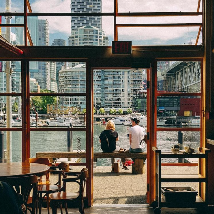
@ladyadventuring shared this candid image of a small moment of calm on Vancouver’s Granville Island.
Composition and the Rule of Thirds.
Composition is fundamental to capturing a great image and speaks to how the elements of a photo are arranged in the frame. The Rule of Thirds is the most well-known principle of photography composition as the basis for a well-balanced shot.
Imagine breaking down a photo into thirds by drawing lines horizontally and vertically, so the image now has nine parts. The rule suggests that you place points of interest at the intersections of these lines or along the lines. Studies show that when viewing images, people’s eyes naturally go to the intersection points, rather than to the center of the shot.
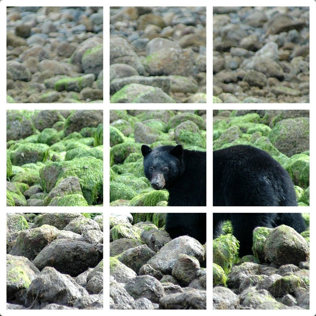
This image by @tomryanyvr illustrates the use of the Rule of Thirds. The subject is positioned over the right vertical line instead of being centered in the picture. Think of how this image would have changed if it was centered.
Rule of Odds
Another common rule of composition, the Rule of Odds, states that an image should have an odd number of objects, not an even number, whenever possible. In other words, an image should have three rocks rather than two, and five people rather than four and so on. Using an odd number rather than an even number produces a more exciting image.
Why? Subconsciously our brains want to group items in pairs, but with an odd set of items, we may gaze at the image longer and observe different photo elements at play. It stimulates the viewer’s brain to work a little harder and look a bit longer.

Some of nature’s perfect examples display the Rule of Odds in this image by @km_photography_radium.
The Movement of Lines (Leading lines)
Leading lines are the perspective points in a shot that make the viewer’s eye follow a particular path. In other words, the viewer’s attention is drawn to lines that lead to the main subject of the image. For example, landscape photography is about finding lines that are pleasing to the eye and then making sure you don’t break the line. If person in the photo should be the center of attention, you’ll want to break the leading lines so they are like arrows pointing to the photo’s subject.
A leading line can be horizontal, vertical, diagonal, or converging.
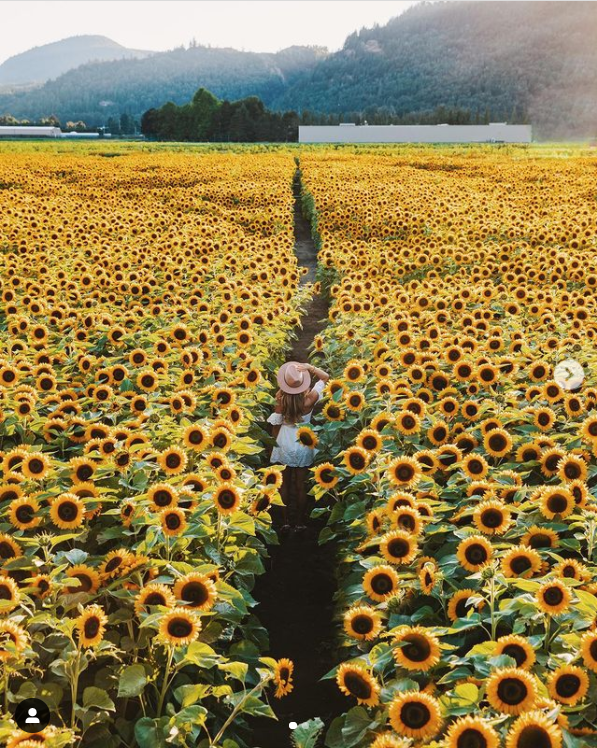
A path in a field of sunflowers creates a leading line that moves your eye along @hikeswithkiki’s image of Lakeland Flowers in Abbotsford.
For more details on leading lines, visit: https://www.phototraces.com/b/lines-in-photography/.
Scale
Sense of scale is a powerful photography technique when you want to emphasize the size of your subject, whether it’s showing off the vastness of a landscape, an interior, or the size of a product. When you’re curating UGC, look for photos where a human is strategically placed in the frame, not as the subject, but as a juxtaposition to emphasize scale. When used correctly, it can make the photo more powerful than if it was lacking the human.
Sense of scale can also work to set expectations about the size of your products and experiences, such as a human hand reaching into the frame to a grab a slice of pizza at a restaurant, a person walking through a museum to show off the scale of the exhibits, or a person relaxing in a hotel room to emphasize the spacious or cozy ambiance.
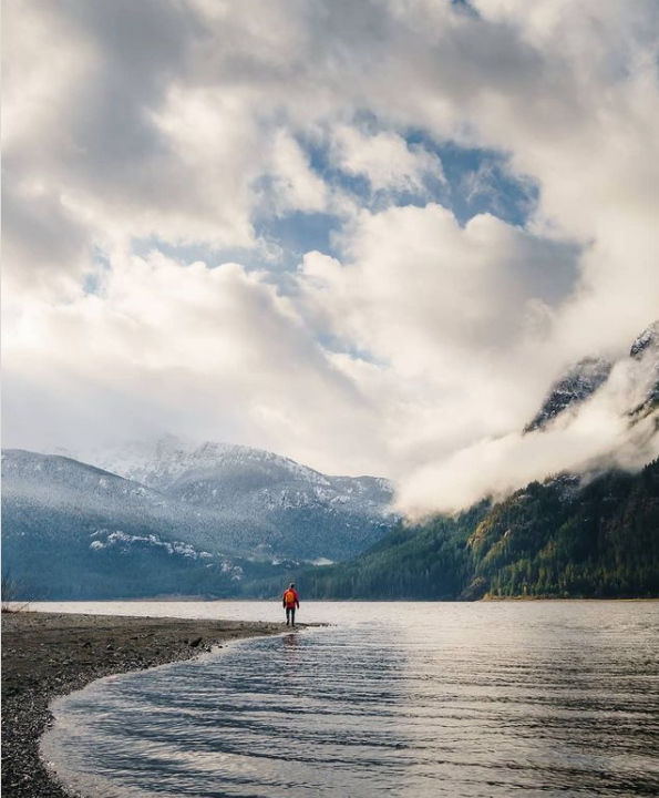
@evanruffellphotography’s image of a person in Campbell River uses scale to emphasize the vastness of landscape.
Depth of Field
Depth of field (DoF) is one of the most important concepts in photography and refers to the distance between the parts in an image that appear in focus. When there’s a considerable distance between the things that look crisp and sharp, it’s known as a wide or deep depth of field. When there’s a short distance, the depth of field is shallow or narrow.
A shallow depth of field, for instance, can be used to draw attention to a subject. This would have the background blurred and the subject clear – such as taking a photo in portrait mode.

This attention-grabbing image of the BC Legislature Building from the Royal BC Museum in Victoria by @sftravels focuses on the view rather than the people.
Colour and Selective Attention
Colour is one of the most powerful cues to help us identify people, brands, objects and more, and the use of colour techniques in photography can help to grab your audience’s attention.
For example, identifying UGC images that align with your brand’s colour palette can help ensure that your content is consistent and recognizable in your audience’s feed. If red is a dominant colour for your brand, you may source UGC content that contains red tones, like someone in a red jacket, or that features a sunrise or sunset to highlight the red hues of the landscape which wouldn’t be visible on a bluebird day.
Colour can be used strategically, as a pop of colour that catches our eye against a monochromatic background or landscape, but it can also be used to warm up an image, like seeing colour in the clouds during sunset/sunrise, or colour of city lights being reflected in the wet pavement on a rainy day.

@zachramelan’s image employs a pop of yellow raincoats on a blue monochrome landscape in Tofino.
Lighting and Shadows
Have you ever noticed that an image taken at midday, or high-noon, on a sunny day, looks harsh and flat, compared to the same image taken at dawn or dusk? Lighting is a critical factor in photography, determining the brightness and darkness of the image as well as the tone, mood, and atmosphere.
Dappled light for example, can add more depth, texture and drama to an image, while bad lighting can suck the life out of colours, eliminate the sense of distance and separation, and produce harsh shadows. When sourcing UGC content, look for soft gradations and shades, versus sharp contrasts.
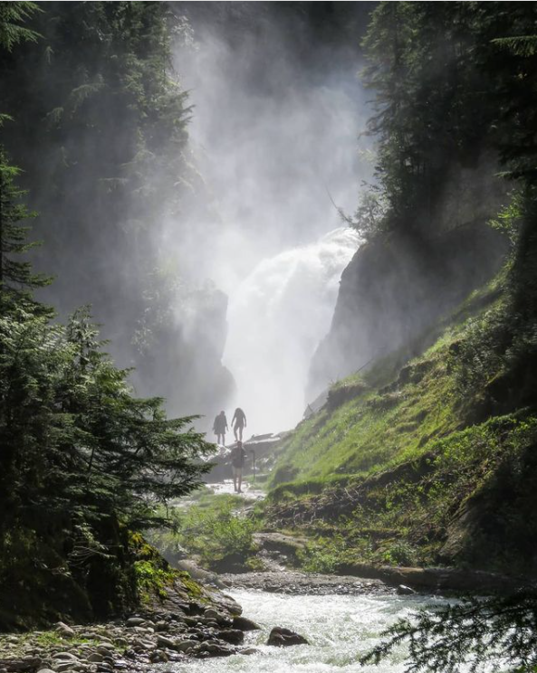
Mist from a waterfall in Glacier National Park creates ambiance, and the shadows from trees provide juxtaposition in this image by @adventures_with_chucky.
Avoid the obvious
Take a moment to scan your social media feed; likely, it won’t take long for you to notice several “typical” photos with people posing and capturing somewhat commonplace moments. As stunning as some of these images may be, consider selecting an image that provides a different perspective and adds an element of surprise rather than an image your audience is likely used to seeing.

It’s very unusual to see otters in the wild, which makes @chase.teron’s image of a family of otters looking straight at the camera even more delightful.
UGC can help your business break through the noise and build trust with your audience. It isn’t staged, overly edited, or professional images; rather UGC is real guests sharing their unique, personal experiences with your business, with their friends and family. UGC is powerful because people trust candid photos from genuine visitors the most.
When selecting UGC images to share with your audience, consider the elements a photographer thinks about to identify the content that will authentically connect you with your audience.

